 TSRVListBox
|
<< Click to display table of contents >>
|
Use TSRVListBox to display a scrollable list of items. Items can have captions, images, check boxes. A list can be hierarchical.
Unit SRVListBox;
Syntax
TSRVListBox = class(TSRVCustomListBox)
TObject
TPersistent
TComponent
TControl
TWinControl
This component publishes public properties inherited from TSRVCustomListBox.
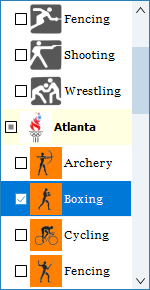
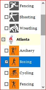
The default list box appearance (if skins are not assigned) depends on SRVControlStyle: TSRVControlStyle property:
srvcsSimple (if RVControlsPainter.Theme = rvctPaleBlue):
srvcsClassic (the scroll bar appearance depends on Windows, this screenshot is for Windows 10)::
The border around the list box has width defined in DisabledBorderWidth, EnabledBorderWidth, MouseInBorderWidth, FocusedBorderWidth properties. When auto-sizing the control, it is assumed that the border width is equal to EnabledBorderWidth.
A border color depends on the list box state (normal, disabled, under the mouse pointer, focused) and SRVControlStyle: TSRVControlStyle property. If it is equal to srvcsSimple, colors are defined by RVControlsPainter (see the TRichView manual). If it is equal to srvcsClassic, colors are defined in EnabledBorderColor, DisabledBorderColor, MouseInBorderColor, FocusedBorderColor properties. The same is for colors used for drawing selected items (SelectedItemBackColor, SelectedItemBorderColor, SelectedItemTextColor).
Item colors are defined in the items properties.
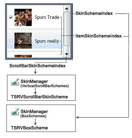
If SkinManager is assigned:
•the control is drawn using SkinManager.CurrentSkin.BoxSchemes[SkinSchemeIndex];
•each item is drawn using SkinManager.CurrentSkin.BoxSchemes[ItemSkinSchemeIndex];
•a scrollbar is drawn using SkinManager.CurrentSkin.VerticalScrollBarSchemes[ScrollBarSkinSchemeIndex].
Example: