 TSRVImagesScroll
|
<< Click to display table of contents >>
|
The TSRVImagesScroll component is used to display images in a scrollable row (or column)
Unit SRVImagesScroll;
Syntax
TSRVImagesScroll = class(TSRVCustomControl)
TObject
TPersistent
TComponent
TControl
TWinControl
TCustomControl
This component publishes the following properties inherited from TSRVCustomControl:
•SkinManager;
•SkinSchemeIndex;
•SRVControlStyle;
•properties inherited from TCustomControl.
New published properties:
Property |
Type |
Default value |
Meaning |
|---|---|---|---|
|
Boolean |
True |
Determines whether items can be rearranged using the mouse. |
|
|
Properties for closing button in each item. |
|
|
TCustomImageList |
|
A link to an image list to display in items |
|
TRVPixel96Length |
10 |
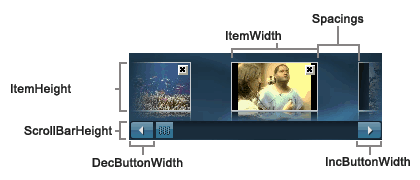
Indent before the first item. |
|
TPenStyle |
psSolid |
Item border pen style. |
|
TRVPixel96Length |
40 |
Item height |
|
Integer |
|
Index of the selected item (in Items) |
|
|
Items, a collection of TSRVImageScrollItem |
|
|
TRVPixel96Length |
80 |
Item width |
|
TSRVImageScrollKind |
srvbkHorizontal |
Determines how images are placed (srvbkHorizontal – in a row, srvbkVertical – in a column). |
|
Boolean |
False |
Determines whether the user can move items outside visible area of the control (if CanMoveImages=True) |
|
TRVPixel96Length |
10 |
Spacing between items. |
New published properties-colors (for non-skin mode):
Property |
Type |
Default value |
Meaning |
|---|---|---|---|
|
TColor |
clBtnShadow |
Item border color. |
|
clBtnFace |
Item color in normal mode. |
|
|
clInactiveCaption |
Item color when pressed. |
|
|
clBtnShadow |
Item color below the mouse pointer. |
|
|
clHighlight |
Item color when selected. |
New published properties related to scroll bar:
Property |
Type |
Default value |
Meaning |
|---|---|---|---|
|
TRVPixel96Length |
0 |
Width of up/left button in a skin mode. 0 for system default. |
|
TRVPixel96Length |
0 |
Width of down/right button in a skin mode. 0 for system default. |
|
Integer |
10 |
Determines how much Position changes when the user clicks the scroll bar on either side of the thumb tab. |
|
TSRVScrollerPosition |
srvpsEnd |
Scroll bar position (srvpsBegin – top/left, srvpsEnd – bottom/right) |
|
Integer |
100 |
Defines a scrolling speed (interval between scrolling events) |
|
Integer |
1 |
Determines how much the scrollbar Position changes when the user clicks the arrow buttons on the scroll bar. |
Published properties related to skins:
Property |
Type |
Default value |
Meaning |
|---|---|---|---|
|
|
Inherited. A link to a skin manager component. |
|
|
Integer |
0 |
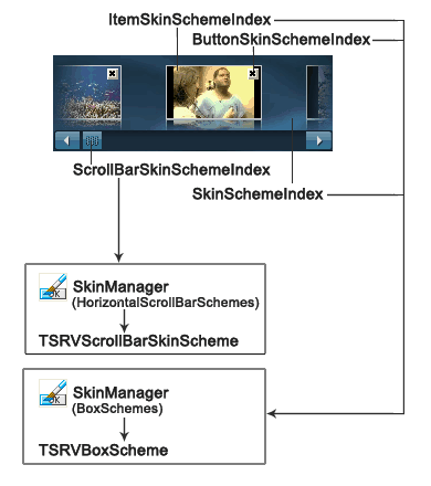
Inherited. Index in SkinManager.CurrentSkin.BoxSchemes, defines the appearance of the whole control. |
|
Integer |
0 |
Index in SkinManager.CurrentSkin.HorizontalScrollBarSchemes (or VerticalScrollBarSchemes in a vertical mode), defines the appearance of scrollbar. |
|
Integer |
0 |
Index in SkinManager.CurrentSkin.BoxSchemes, defines the appearance of each item. |
|
Integer |
0 |
Index in SkinManager.CurrentSkin.BoxSchemes, defines the appearance of closing buttons. |
type
TSRVCloseImageScrollEvent = procedure(Sender: TSRVImagesScroll;
ItemIndex : Integer; var CanClose : Boolean) of object;
TSRVImageScrollMoveEvent = procedure(Sender: TSRVImagesScroll;
NewImageIndex, OldImageIndex : Integer) of object;
TSRVDrawImageScrollEvent = procedure(Sender: TSRVImagesScroll;
Canvas : TCanvas; ARect, PaintRect : TRect; State : TSRVDrawStates;
var DoDefault : Boolean) of object;
TSRVDrawImageScrollItemEvent = procedure(Sender: TSRVImagesScroll;
Canvas : TCanvas; ARect, PaintRect : TRect; ItemIndex : Integer;
State : TSRVDrawStates; var DoDefault : Boolean) of object;
OnChange: TNotifyEvent occurs after a new item is selected.
OnItemMove: TSRVImageScrollMoveEvent occurs when two items exchange their places as a result of item moving. Similar to OnMoveTab for TSRVTabSet.
OnCloseItem : TSRVCloseImageScrollEvent occurs when the user attempts to close an item.
OnDrawBorder, OnDrawBackground, OnDrawItem, OnDrawCloseButton: TSRVDrawImageScrollEvent allow custom drawing for the corresponding objects. Canvas – a canvas where to draw. ARect – a rectangle defining the position of the object to draw. APaintRect – a rectangle that needs to be redrawn; you can use this parameter to optimize drawing. State – a set describing the current object state. Set DoDefault to False to prevent the default drawing of this object.
The default appearance (if skins are not assigned) depends on SRVControlStyle: TSRVControlStyle property:
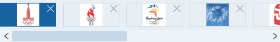
srvcsSimple (if RVControlsPainter.Theme = rvctPaleBlue):
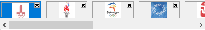
srvcsClassic (the scroll bar appearance depends on Windows, this screenshot is for Windows 10):
If SRVControlStyle = srvcsSimple, all colors are defined in RVControlsPainter (see the TRichView manual for details).
If SRVControlStyle = srvcsClassic, the control uses Color, ItemBorderColor, ItemColor, ItemDownColor, ItemHotColor, ItemSelectedColor properties.
If SkinManager is assigned, the control is drawn using SkinManager.CurrentSkin.BoxSchemes[SkinSchemeIndex], the scroll bar is drawn using SkinManager.CurrentSkin.HorizontalScrollBarSchemes[ScrollBarSkinSchemeIndex] (or VerticalScrollBarSchemes, if a scroll bar is vertical).
Example:
 CanMoveImages