
We are pleased to announce the new release of TRichView, version 24.2.
A trial version is available here: https://www.trichview.com/download/
Main new features:
- TRVEditHelper component
- TRichView FMX Tools
TRVEditHelper

TRVEditHelper is a new component that simplifies working with TRichViewEdit (and TDBRichViewEdit). For VCL and Lazarus, it can be used as a lightweight alternative to RichViewActions, making it easy to implement editing operations that do not require a user interface. In FireMonkey, it serves as the foundation for a new set of UI tools, the first version of which is included in this release (see below).
This is the first release of TRVEditHelper. It provides functionality for working with text and paragraph properties. Additional features will be added in future releases.
When working directly with TRichViewEdit, operations on text and paragraph properties are typically implemented in the OnStyleConversion and OnParaStyleConversion events. This approach is not very intuitive and usually requires more code than necessary.
TRVEditHelper provides a much simpler methods.
Example: making selected text bold:
RVEditHelper1.TextStyle.Style := [fsBold];
RVEditHelper1.ValidTextProperties := [rvfiBold];
RVEditHelper1.SetTextStyleToEditor(RichViewEdit1);The first version includes methods for modifying selected text and paragraph properties, as well as commands for increasing and decreasing paragraph indentation.
TRichView FMX Tools 1.0
Introduction
his is the first release of a new set of components for building a user interface for our editor in FireMonkey.
I initially considered calling it RichViewActions FMX or something similar. However, I decided against it because the name would be misleading. While the new components have the same goal as RichViewActions, they are not a FireMonkey port of RichViewActions. Instead, they are based on a different approach to user interface implementation.
RichViewActions are based on command actions and modal dialog boxes. This approach is convenient and familiar for desktop applications, and RichViewActions works very well on Windows and Linux (in the Lazarus version). FireMonkey, however, requires a different, cross-platform-oriented approach to user interface design.
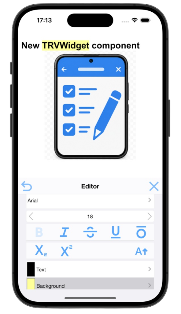
The new user interface is built around widgets – non-modal panels that can be placed on the same form as the editor. In desktop applications, they can also be placed in floating tool windows.
The first release includes a widget for editing text properties (fully implemented) and paragraph properties (partially implemented). It will be expanded with additional functionality in future releases.
Additional specialized widgets will be added later, along with actions for executing simple commands that do not require a user interface.
Widgets do not use pop-up dialogs. Instead, all controls are contained directly within the widget. Navigation between different sets of controls is implemented by switching widget pages with animated transitions, making interface changes easier to follow.
TRVSVGPathButton
Before describing the widgets themselves, I’d like to introduce a simple control they use: a command button with an SVG icon (more precisely, an icon defined by an SVG path): TRVSVGPathButton.
FireMonkey includes button styles with a set of built-in icons, but they are far from sufficient for a rich text editor. We needed a solution that would allow custom icons to blend seamlessly with the current FireMonkey style, without requiring a separate set of images for every platform and every style.
The solution was to render SVG paths using the button’s text color defined by the active FireMonkey style. A simplified version of this approach was already used in the TRVChat demo application with standard FireMonkey controls. The new component, however, is much more flexible.
Most importantly, it automatically updates the color and opacity of the SVG icon when the corresponding text properties change. This is essential for implementing toggle buttons that behave correctly with iOS-style themes. In addition, the component supports specifying an SVG viewBox, ensuring that icons are scaled without distorting their aspect ratio.
TRVControlPanel
Now let us look at the component that stores settings shared by other TRichView FMX Tools components: TRVControlPanel.
Its purpose is very similar to that of TRVAControlPanel in RichViewActions. In both components, one of the most important properties is Language, which specifies the user interface language. However, their behavior differs in several ways.
TRVAControlPanel in RichViewActions
When a component or action has no assigned TRVAControlPanel, it uses the default control panel. The first TRVAControlPanel created becomes the default one. If no form contains a TRVAControlPanel, a hidden control panel is used instead.
After changing the language, special procedures must be called to apply the new language to components and actions.
Default language: English.
TRVControlPanel from FMXTools
When a component has no assigned control panel, it uses default settings, including English as the user interface language.
When the language is changed, all linked components update their user interface automatically. No additional code is required.
Default language: autodetected (OS-default language is used, if possible).
UI Languages
Because the user interface is built around widgets – which are somewhere between toolbars and dialog boxes – FMX Tools contains much less text than RichViewActions. Wherever the purpose of a control is obvious, no text is displayed. Most of the remaining text consists of tooltips, which are not used on mobile platforms. As a result, localizing FMX Tools is a much smaller task than localizing RichViewActions.
The translations included in the first release of FMX Tools were created with the help of AI. The release includes all languages currently available in RichViewActions, as well as several new ones: Arabic, Greek, Hebrew, Indonesian, and Vietnamese.
I would greatly appreciate feedback and corrections from both the RichViewActions translators and all other users. As in RichViewActions, language files are Pascal units. For example, the French translation is stored in FMX.RV.Localize_Fr.pas. These files are located in the FMXTools\Source directory.
EditHelper
TRVControlPanel contains an embedded TRVEditHelper, available through the EditHelper property. Since the helper is part of TRVControlPanel, there is no need to create a separate TRVEditHelper component when using FMXTools. Simply use TRVControlPanel.EditHelper.
TRVWidget
The first release includes a single widget, TRVWidget, which will serve as the main building block of FMX Tools.
In this initial version, it provides editing of all text properties, as well as paragraph alignment.
Using TRVWidget is straightforward. Place it on the form next to a TRichViewEdit control and assign the Editor property.
To customize the user interface language or other shared settings, add a TRVControlPanel to the form and assign it to the widget’s ControlPanel property.
You should also either handle the OnClose event or hide the Close button by setting the CloseButton property to False.
By default, all sections on the widget’s main page are displayed one below another. At present, there are two sections: Text Properties and Paragraph Properties.
The MainTabView property changes this layout so that only one section is visible at a time. The user can switch between sections using the button in the upper-left corner of the widget.
If the content does not fit within the available space, a vertical scroll bar is displayed automatically.
Several additional pages are provided for editing specific properties. These include pages for selecting the font family, underline style, and color. Color selection is split into two pages: one for predefined colors and another for choosing any color.
The custom color page accepts HTML/CSS color values, including hexadecimal notation (for example, #FFFFFF), named colors (such as chocolate), and rgb() and rgba() functions.
Button images
TRVWidget uses Google Material Symbols and Icons for button images. Google Material Symbols and Icons are licensed under the Apache License, Version 2.0
http://www.apache.org/licenses/LICENSE-2.0
It allows using Google Material Symbols in free and commercial applications.
If you do not want to use Google Material Symbols, you can assign your own SVG paths to images, using the global variable RVButtonImages from FMX.RV.ButtonImages.pas.
In future versions, it will be possible to use images from a TImageList instead of SVG icons.
For Android and iOS applications, it is strongly recommended to enable Skia support. This provides high-quality rendering of the SVG icons used by the buttons.